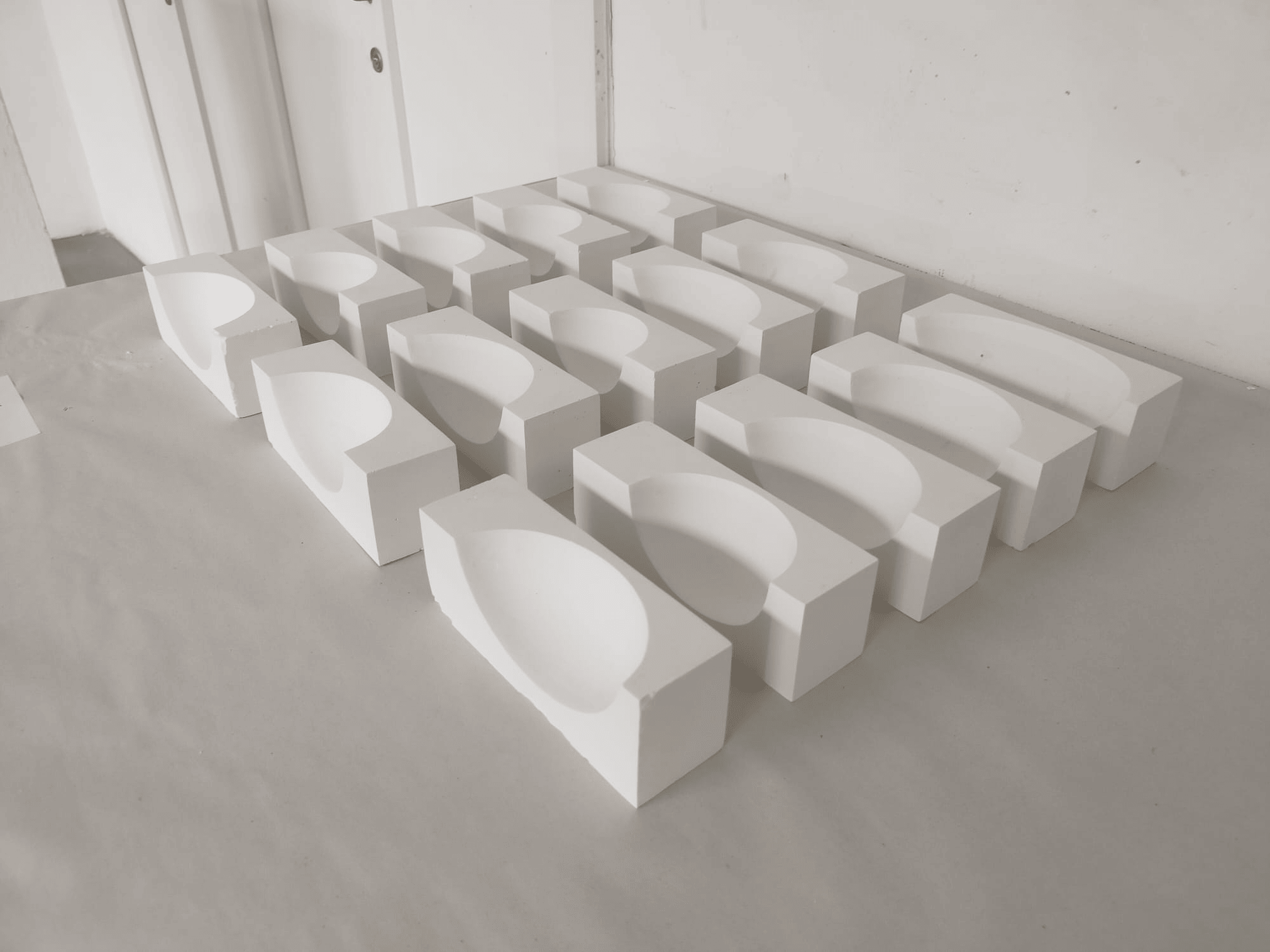
exit 3D mode 
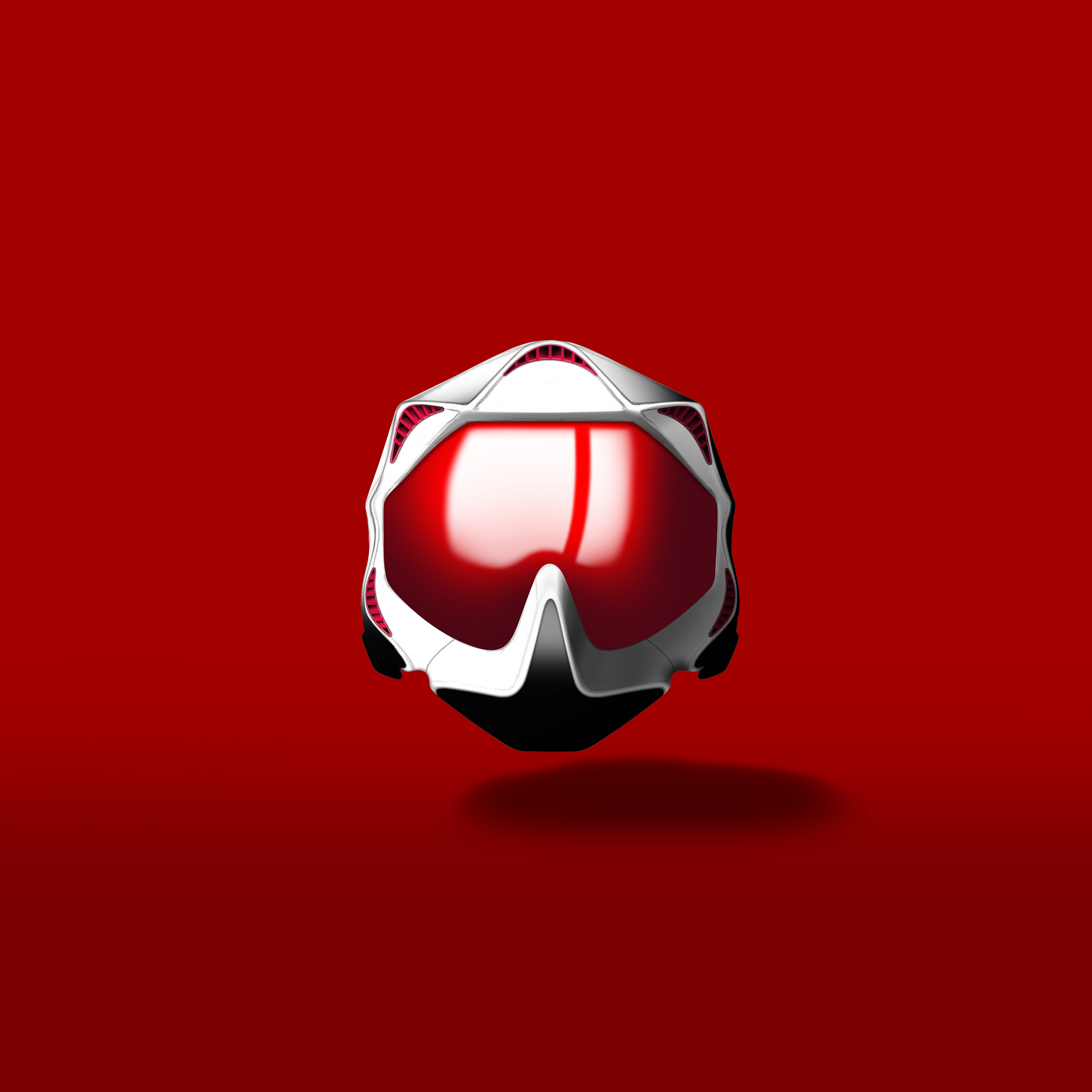
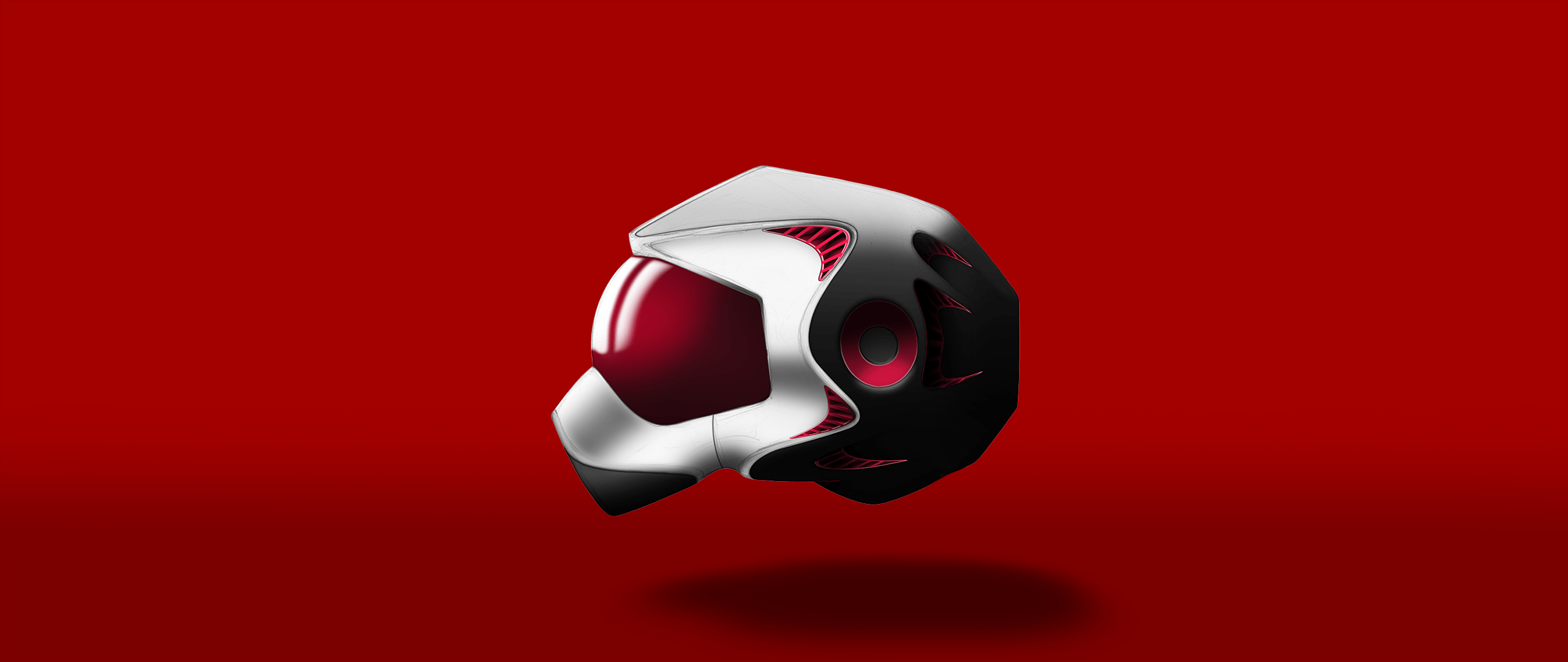
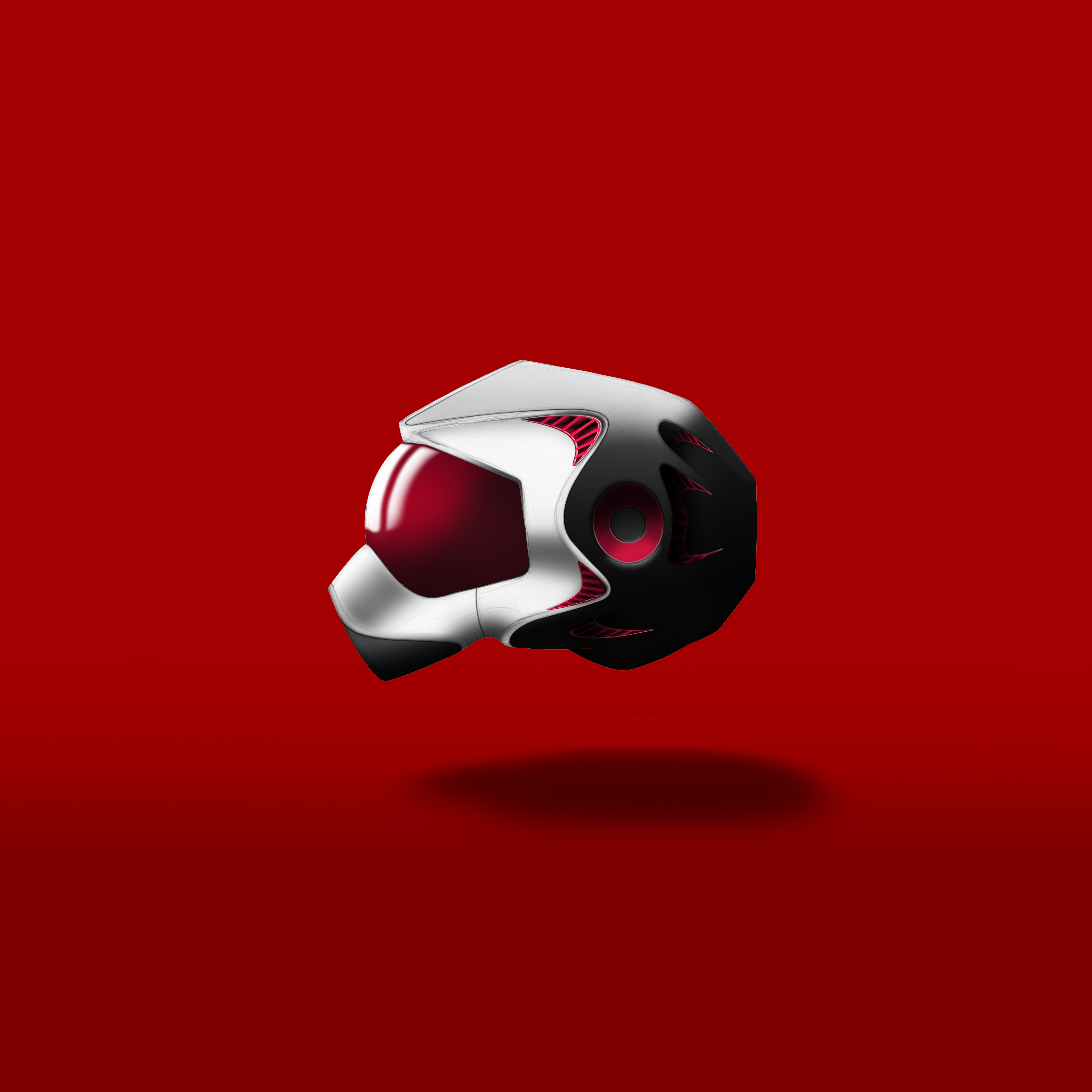
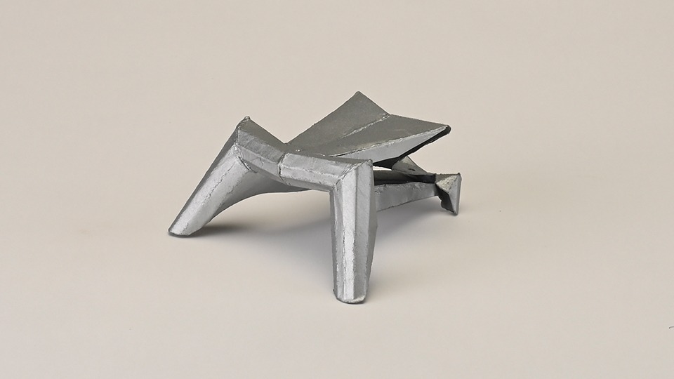
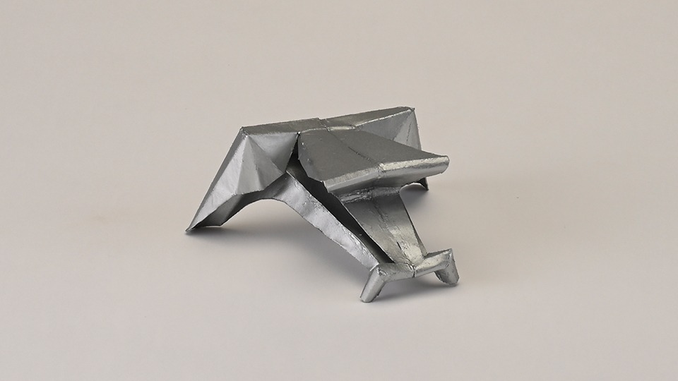
scorpion headphones
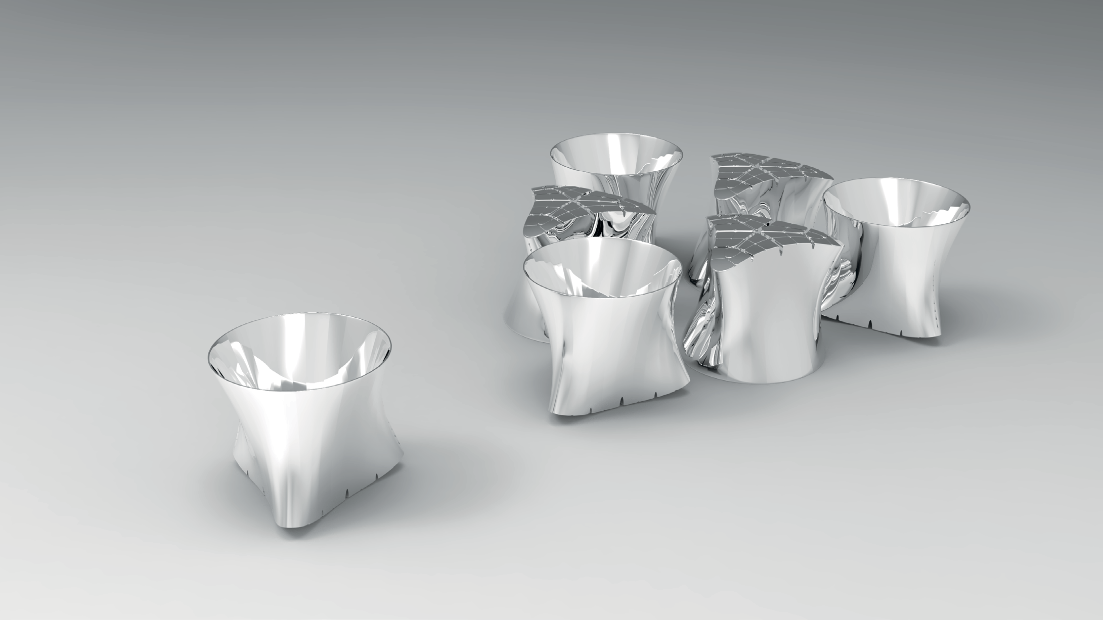
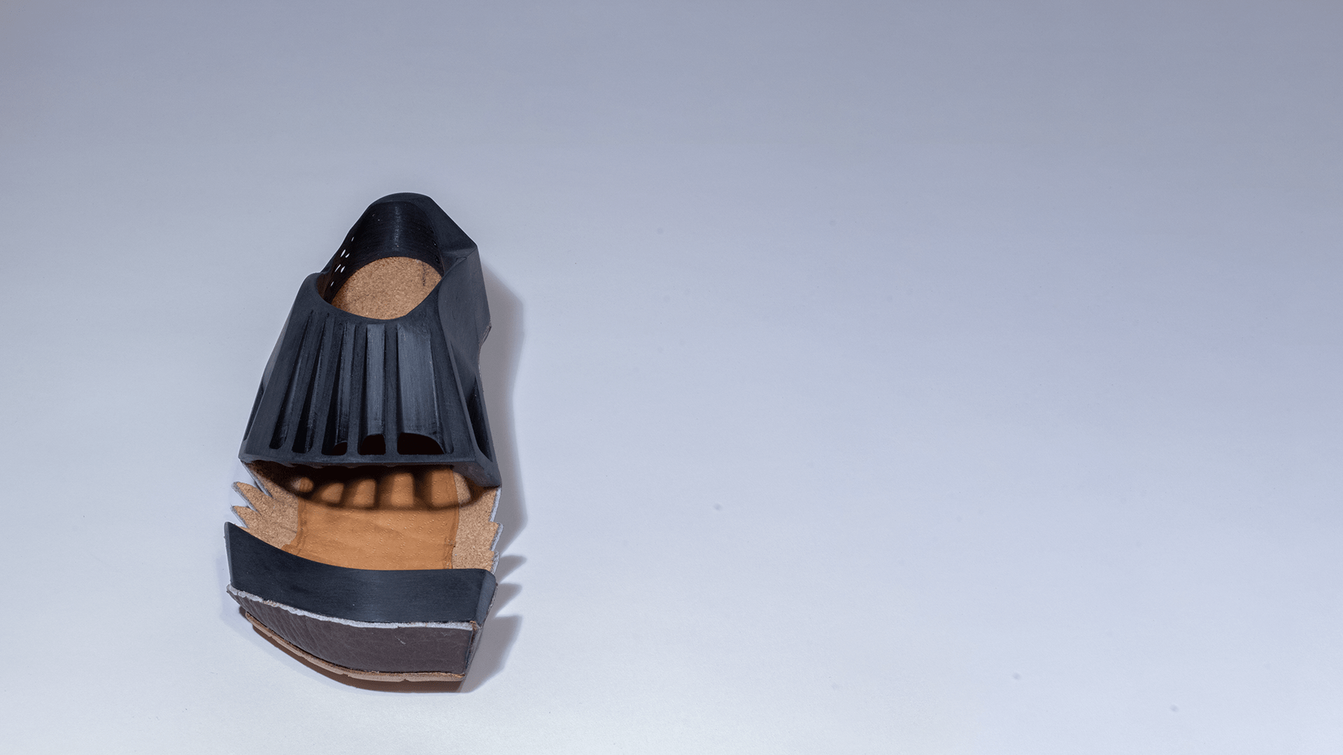
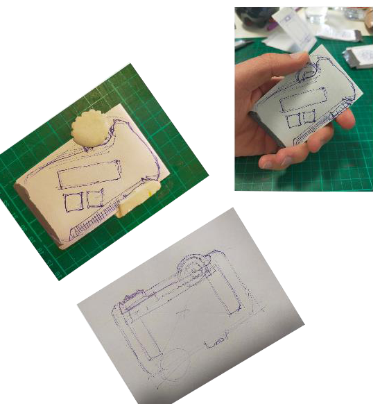
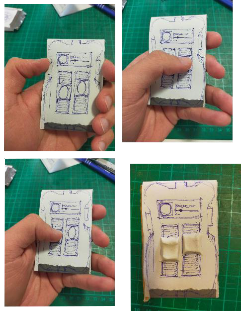
Form Follows Music
or how a song manifests itself in the form of headphones.
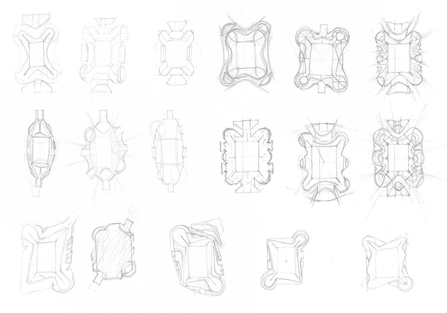
The project started with the emotional analysis of a song. How does it feel and what does it trigger in us. This was the basis for the development of a wide variety of headphone concepts that go far beyond the familiar product spectrum and introduce new ideas, functions and design languages into the rather classic headphone world.
over-ear
- Cables interfere with work & exercise
- Cables often break
- Over-ear headphones weigh a lot
- And they heat up the ears, making them impractical for exercising & working.
- They are also not transportable without an extra bag.
in-ear
- Battery life of in-ear headphones is too short.
- In-ear headphones can easily fall out.
- When you take them out to do something in teamwork, your hands are directly full, making you inflexible.
- They are also difficult to use (touchpads, double occupancy).
- Headphones could always be louder.
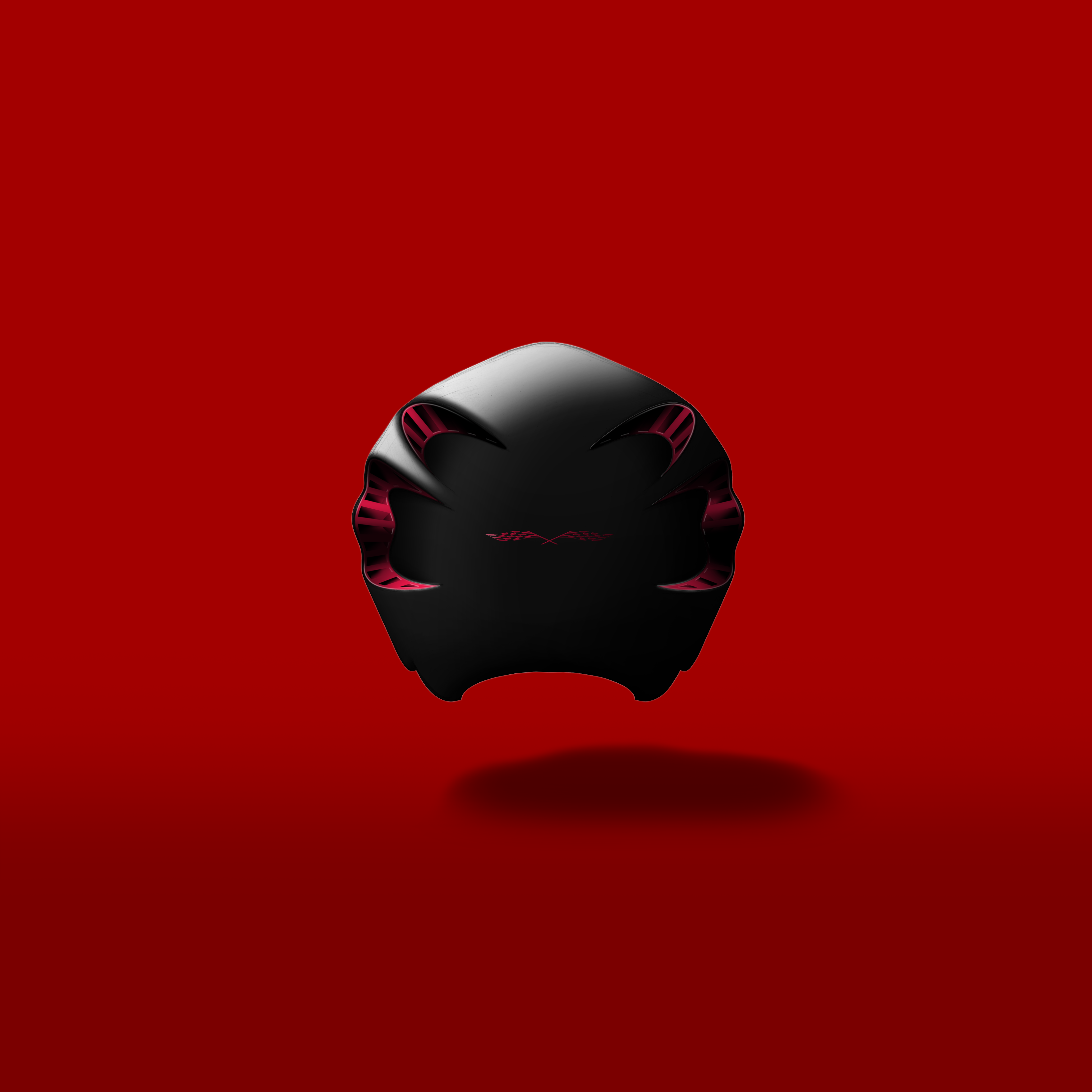
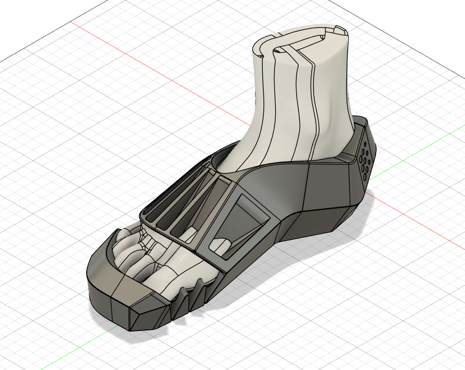
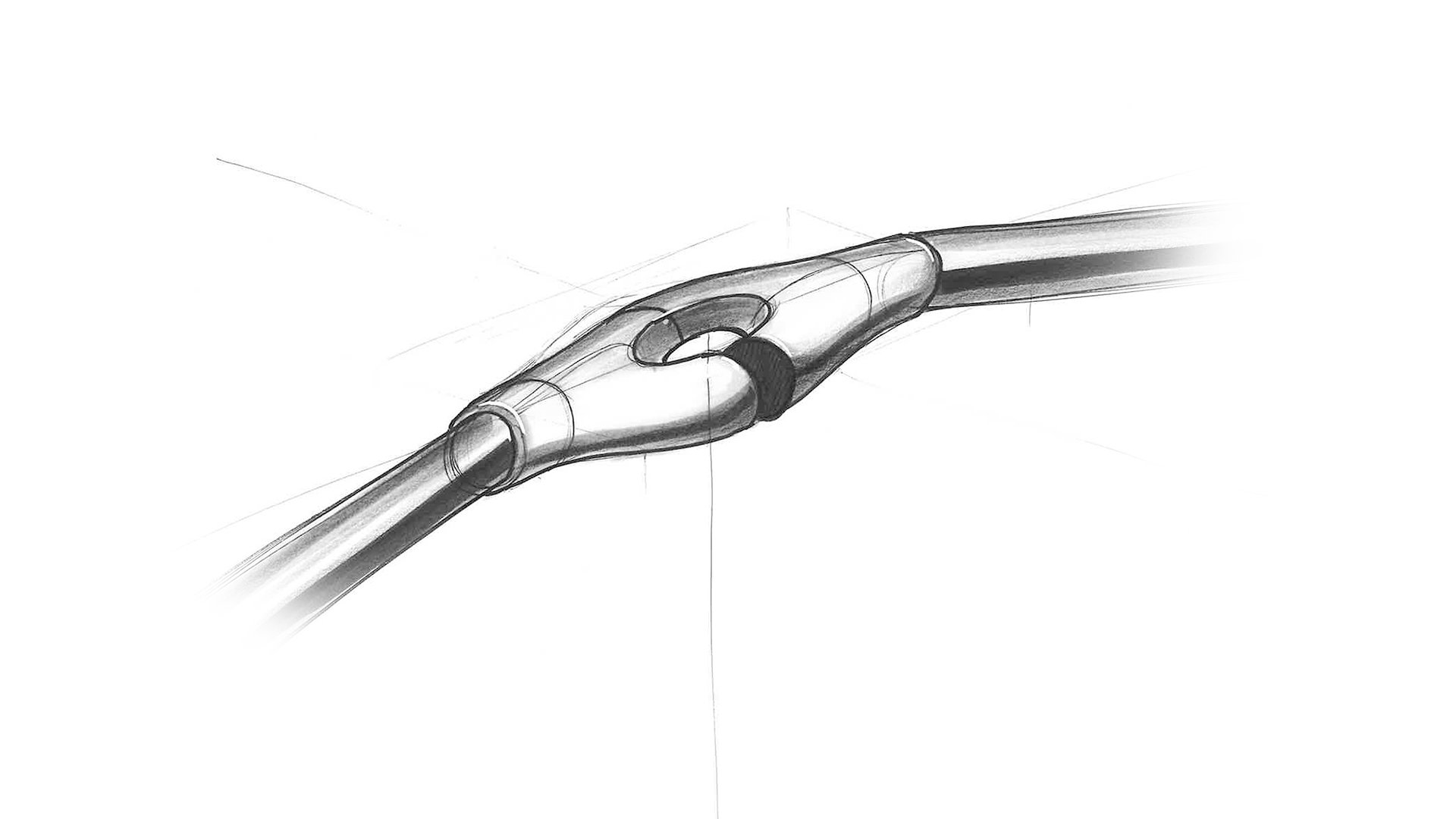
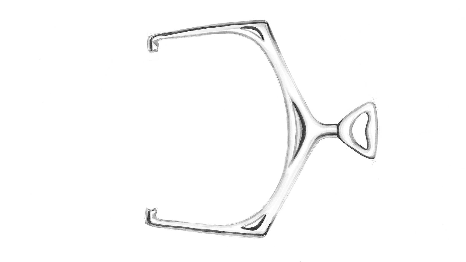
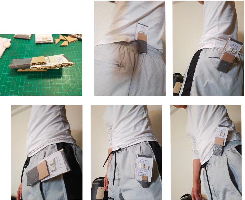
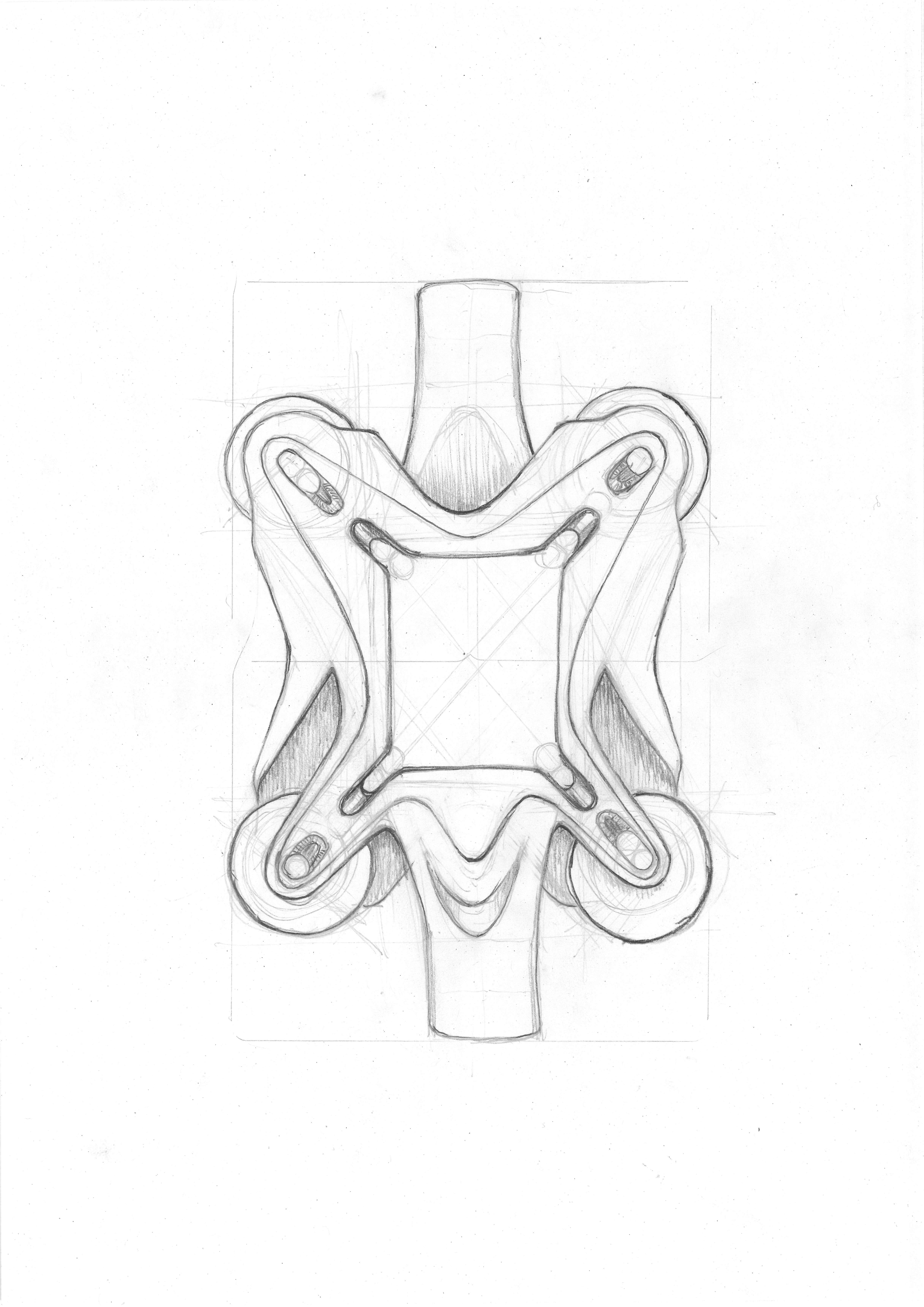
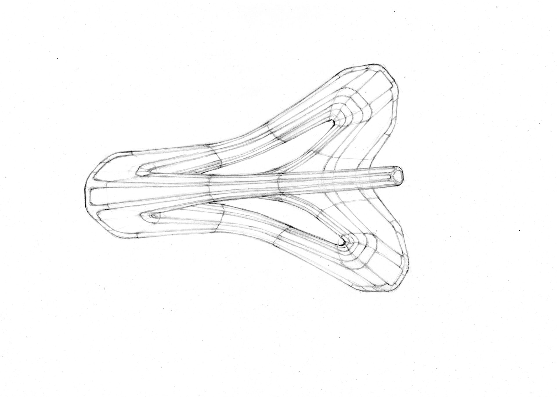
Bridges
Through the bridges, the headphones rest easily on your shoulders.
There is also extra room for an increased battery life.
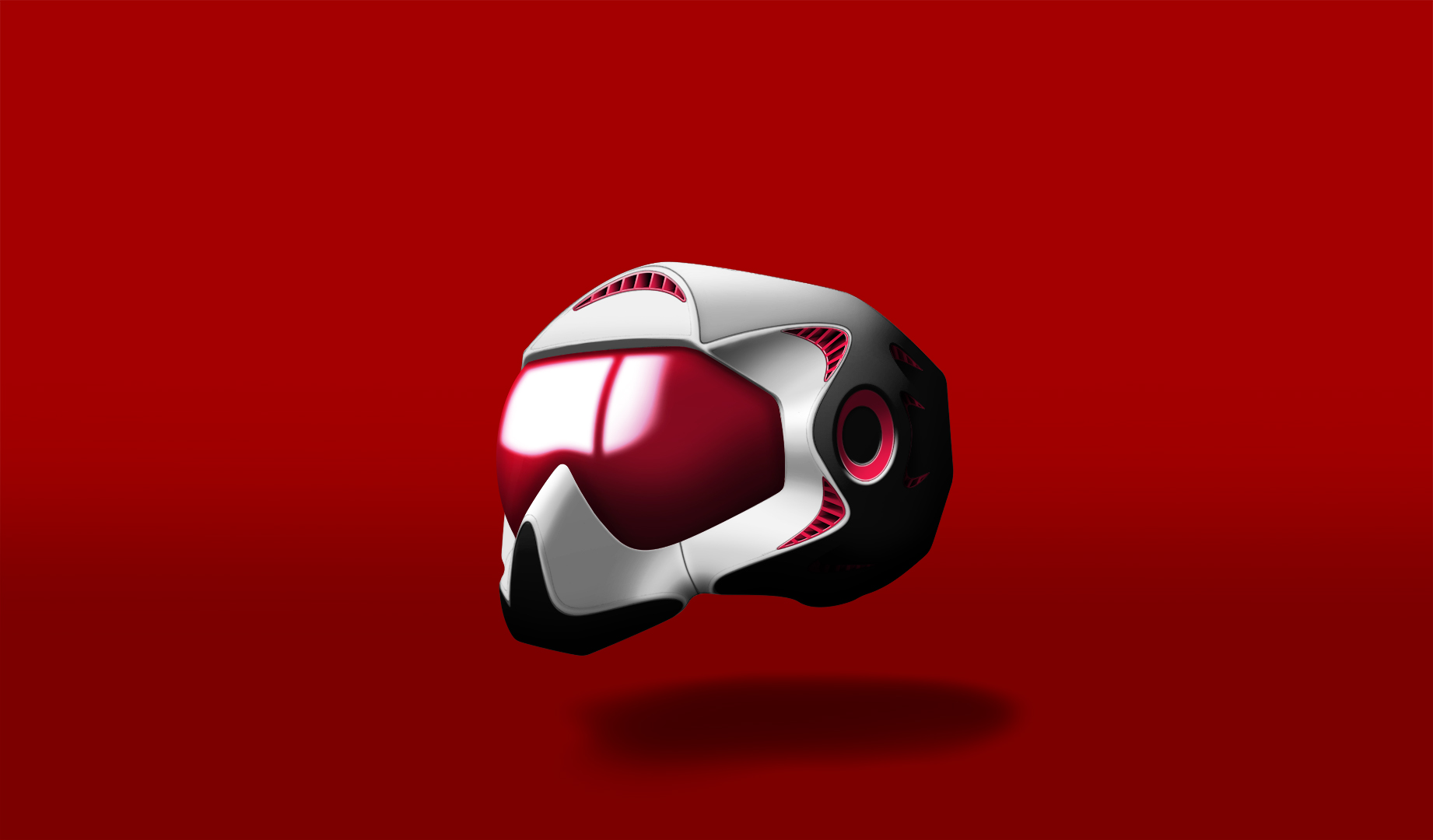
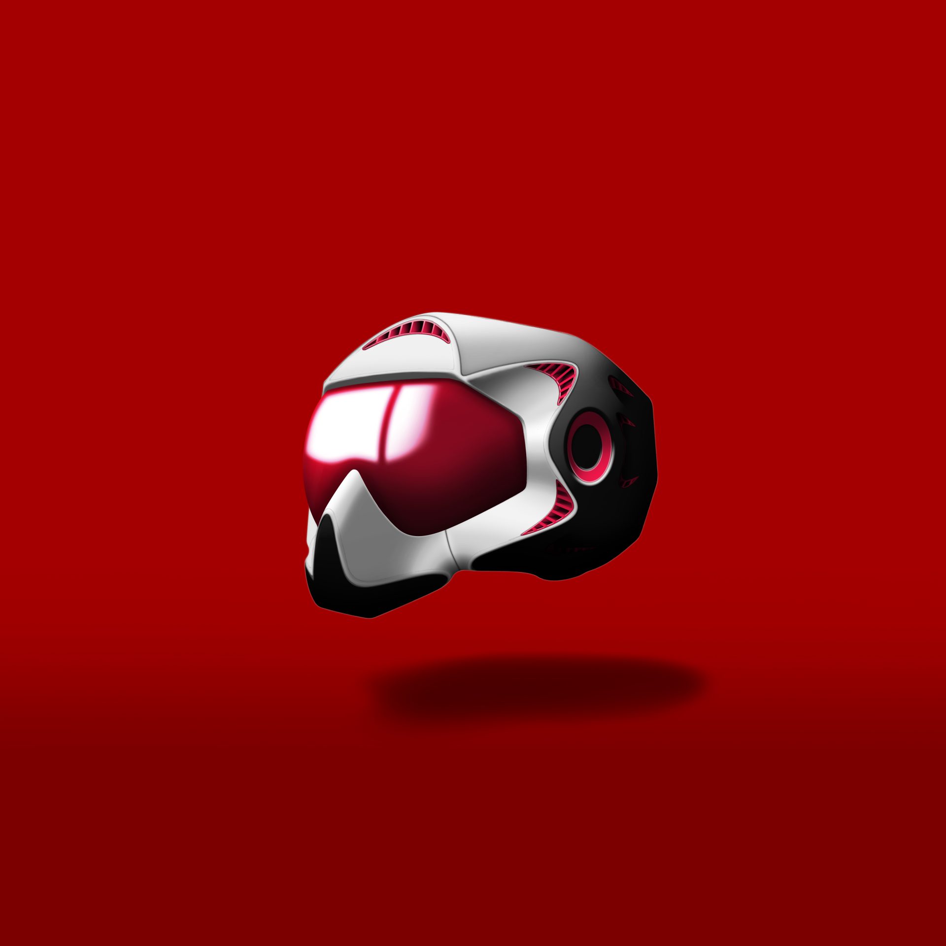
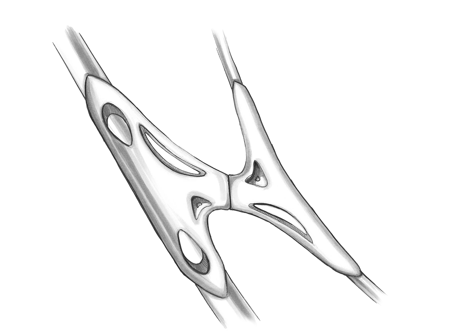
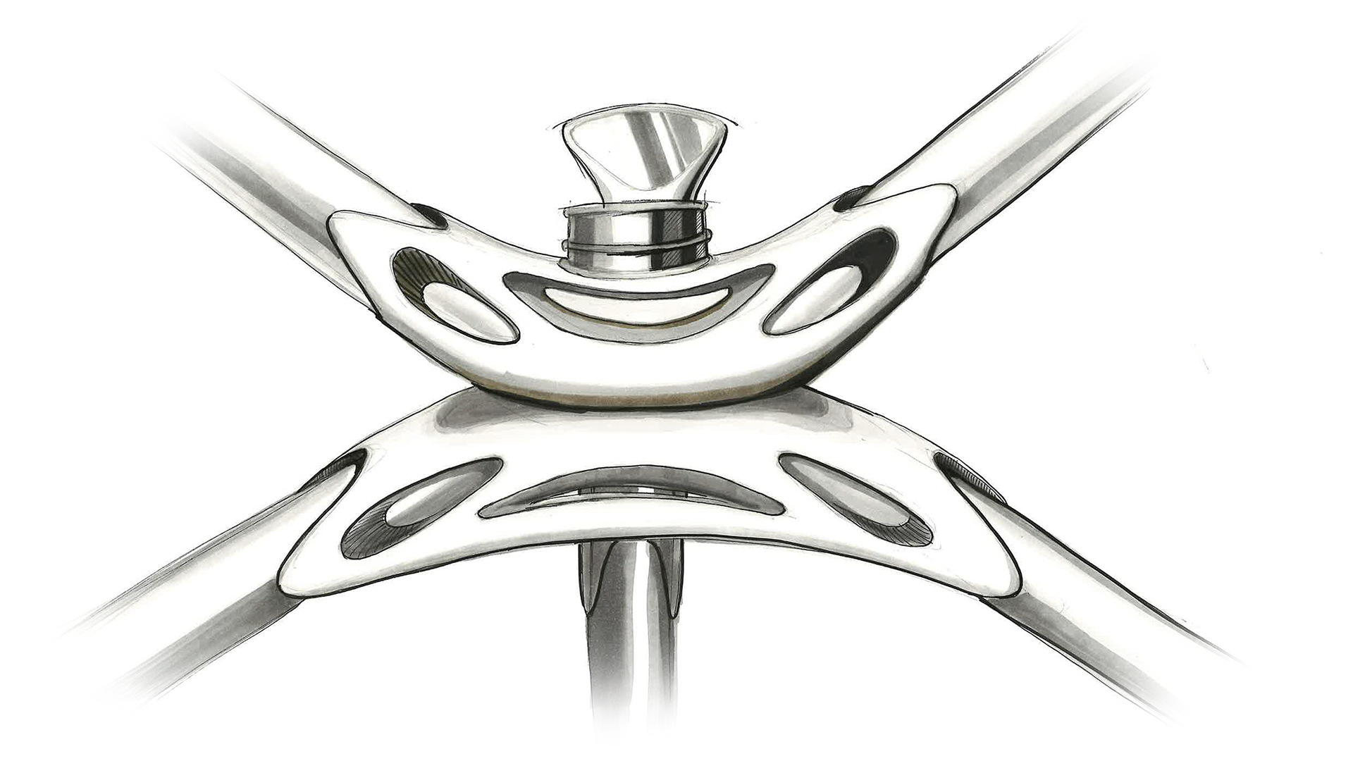
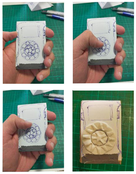
User Interface
The center dial combines two functions.
Volume, treble and bass can be adjusted directly on your headphone, independent of your playback device.
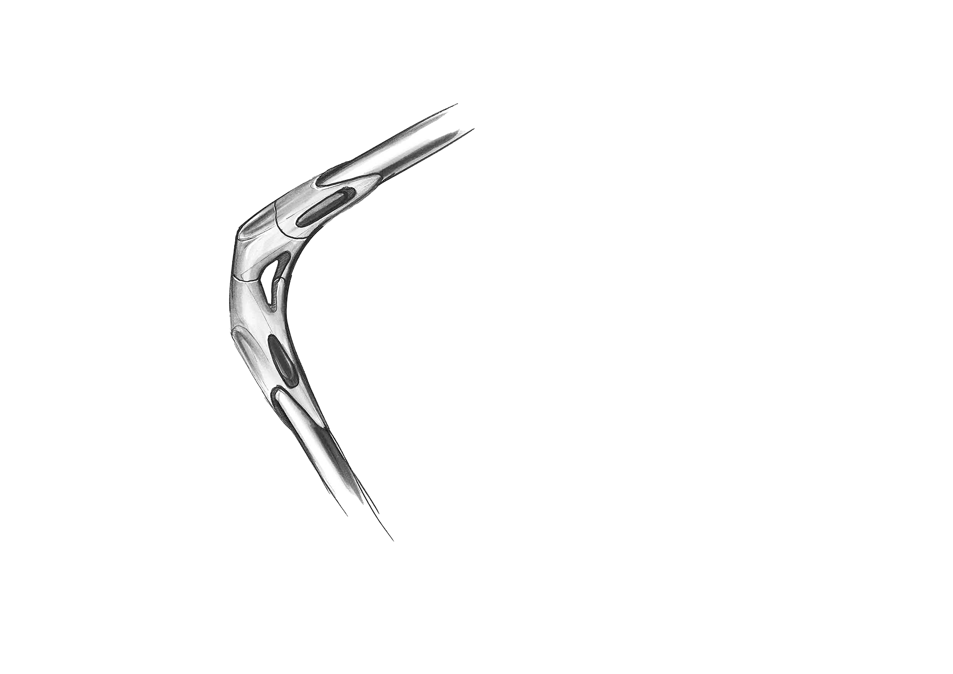
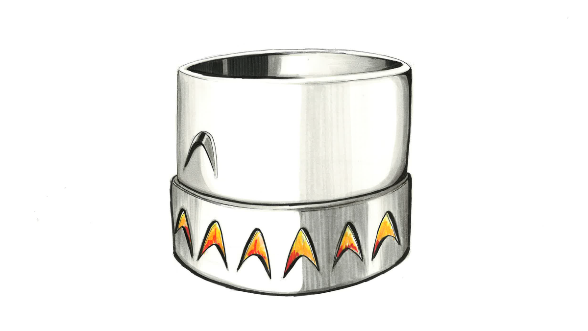
Dials
The dials click in small precise steps.
This allows fast and intuitive usage: Any part of a song/album/playlist can be aproached easily.
The magnets of the speakers are visible at the tip of the dials, so you can see them vibrate while in usage.
The earpieces cannot fall out, since they are pushed in firmly.
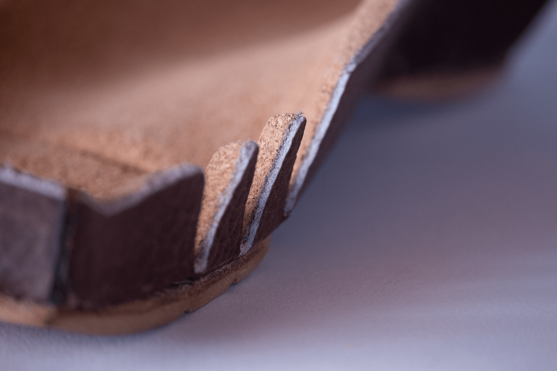
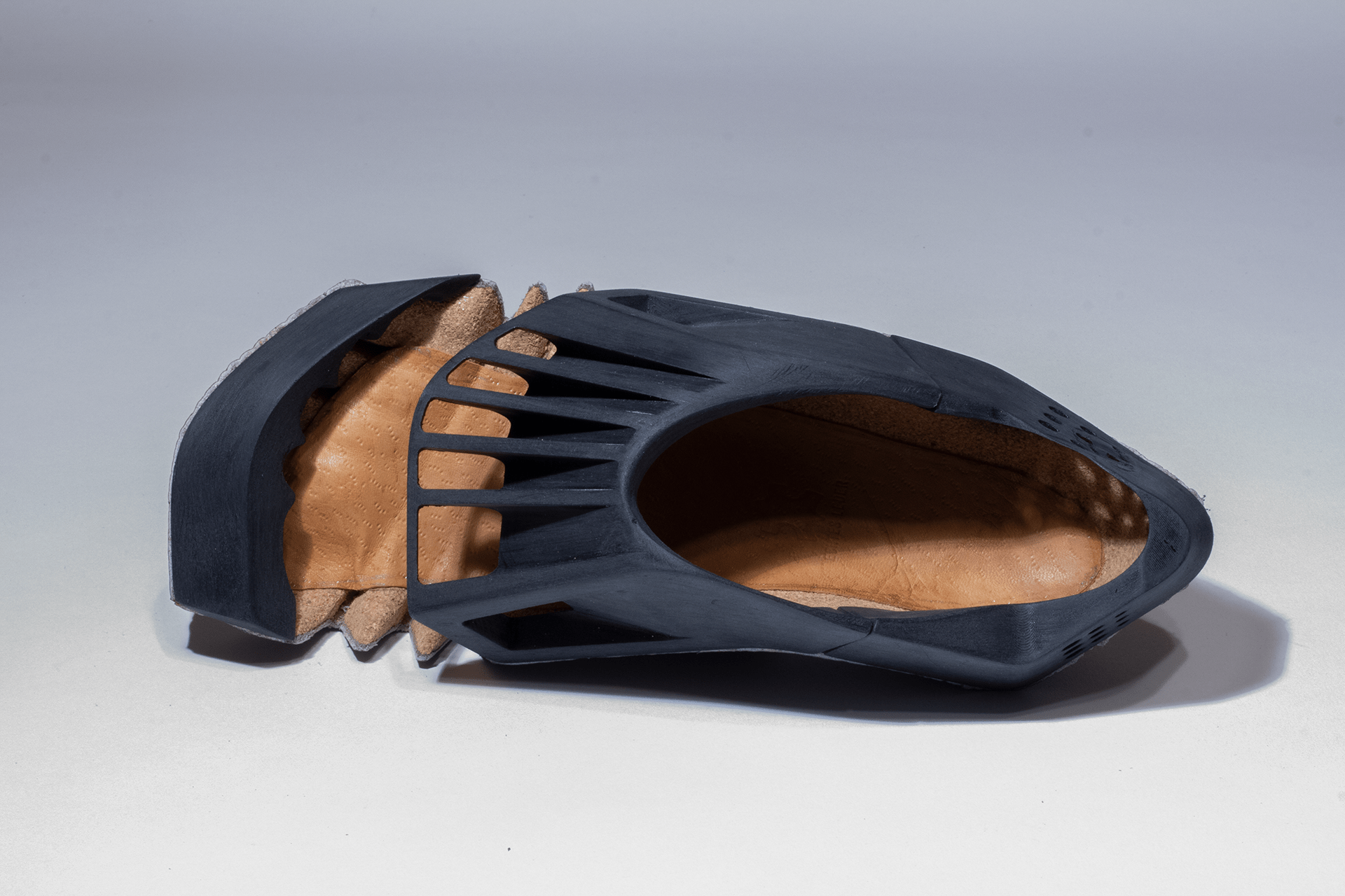
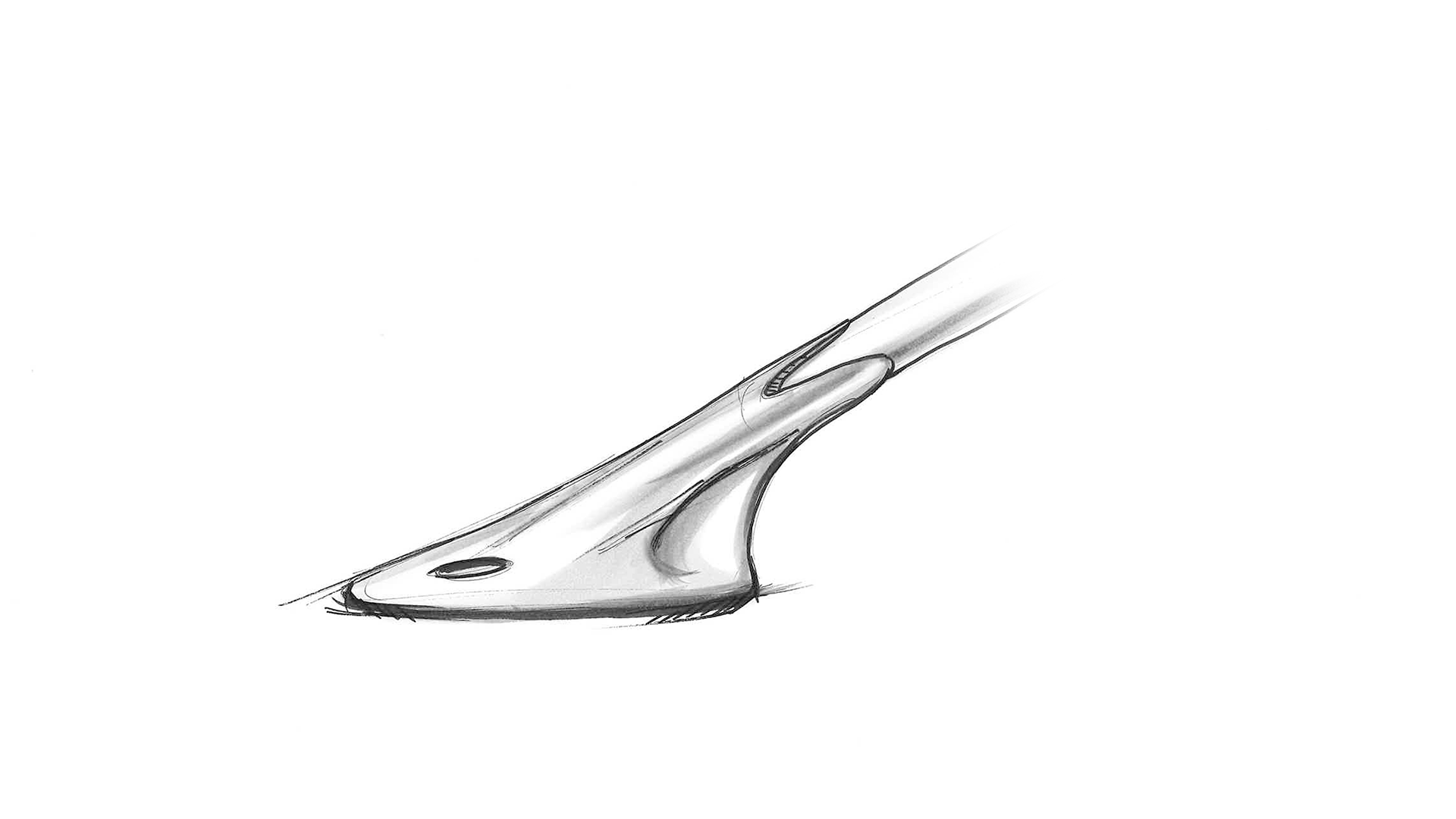
Tubes
There are 6 wires for the three speakers on both sides.
The wires are enclosed by tubes to prevent interference with your work or exercise.
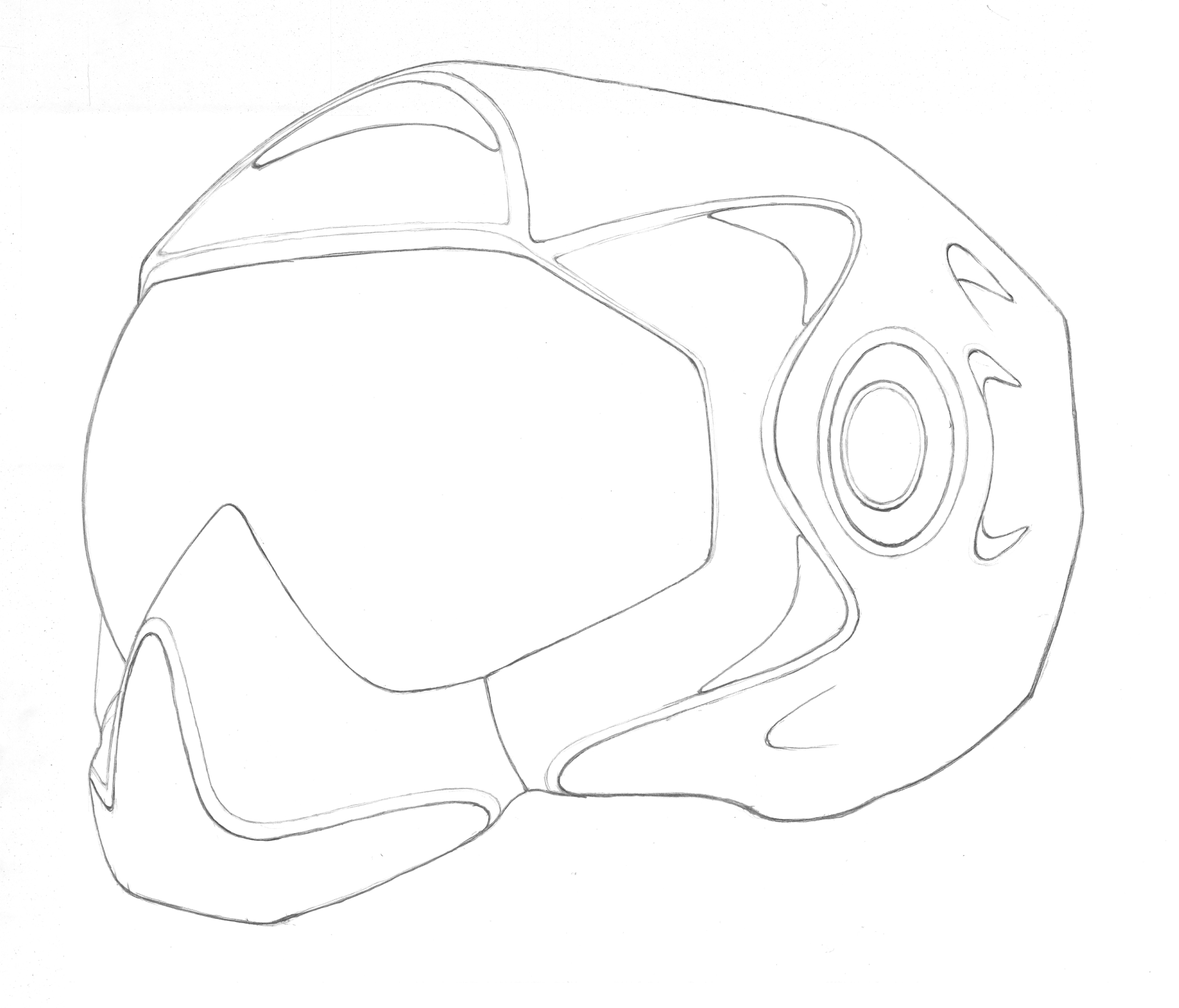
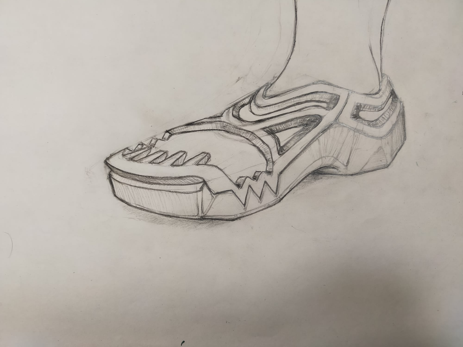
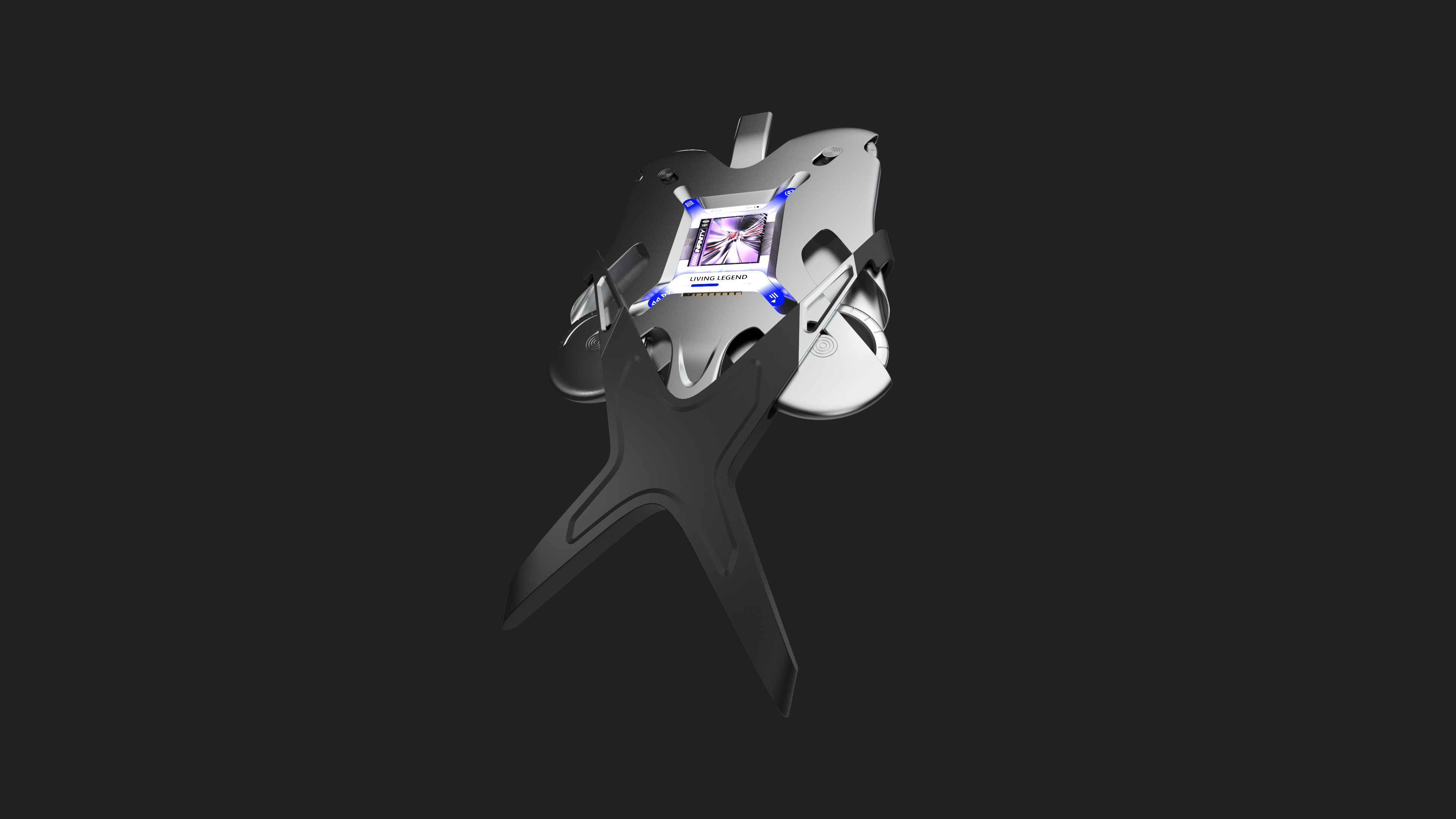
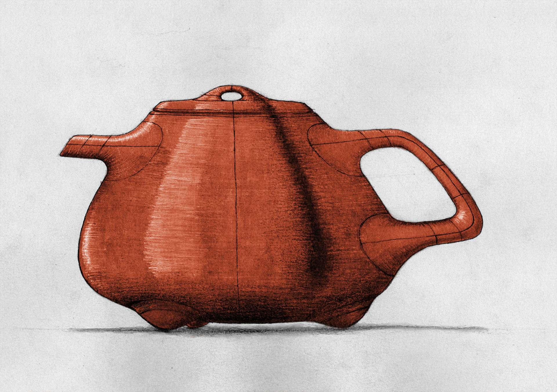
Appearance
I tried to give the headphones an aggressive look while maintaining their 'pure functionality' and synthetic appearance. They seem to grab onto your head and ears — without sacrificing comfort. The Tubes (with the wires inside them) aim to bring the raw insides and functionality to the surface.